- General
-
 Ideas
Ideas

Expanded profile card
Dear fellow WoP-people
With the introduction of In-Game Occupations, the profile/ID “card” is starting to look rather cramped. To increase the usefulness and usability of the profile card, I have made a wireframe for an expanded profile card. This is based on a corpus of profile cards from other sites.
Preliminarily, it looks like this:
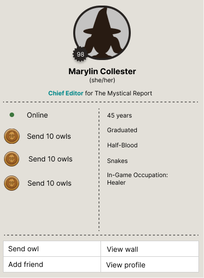
I imagine the expanded profile card will pop up when you hover over character names. Then, if you hover over the profile card, it will stay until you hover away from it again. This will make you able to click the buttons at the bottom.
Below, I will argue for my choices in the order that they appear on the card.
Profile picture: It s now shaped like a circle instead of a square. This is to make it appear lighter. It appears on top along with the character name to state some of the most general information.
Personal pronouns: Instead of stating gender anywhere on the expanded profile card, I put the pronouns in there instead. I found pronouns to be more relevant, especially after the introduction of the non-binary gender option. The pronoun addition should also work great if you are on a roleplay topic with someone new, whose pronouns you are unfamiliar with. Then this section of the profile card will help you address them correctly.
Job: Since many jobs have the same job colour, I let this section elaborate to state the specific job. This would also work well for management, teachers, journalists, etc. where they have the same job colour but not the exact same job.
Online status: Other than having the coloured indicator dot, this part also explicitly states the user’s online status, for those who may not be familiar with the different online status colours. This also works as a solution to a previous idea of mine.
Achievements: Like the online status, this explains what the achievement badge indicates.
Blood status: With the extra space, I added blood status.
Send owl, view wall, add friend & view profile buttons: I added these to skip one step in the process of sending an owl to a specific user, adding a specific user as a friend and viewing the profile. This is with the 3-click rule in mind. It may already take a lot of time to find a specific user. This will eliminate one step in finding some of the specific content for that user.
There is also a button to take you directly to the wall of the user which is where you usually end up after clicking someone's name.
As I mentioned, this is just preliminary. I am open to any changes. I appreciate feedback and suggestions in the comments. Let's have a discussion!
Customer support service by UserEcho
